Sometimes an image or a symbol becomes so synonymous with a work of literature that it’s impossible to think of the book without calling it to mind. For the Harry Potter series, there’s the lightning bolt-shaped scar. Mary Poppins has her top hat and her parrot-headed umbrella. The Lord of the Flies has the all-powerful conch shell and poor Piggy’s broken glasses. F. Scott Fitzgerald’s most beloved novel The Great Gatsby is no exception.
Written at the pinnacle of the 1920s Jazz Age, The Great Gatsby is the ultimate social commentary of that time. No wonder it’s had such a diverse collection of covers since its 1925 publication. Surprisingly, every cover isn’t filled with glitz and glam, as one would expect. It’s interesting to see how each designer chose to interpret the text—what scenes or characters felt important enough to put on the cover. Below are just a few that highlight the many levels of this classic. This year it was selected as one of the 100 best-loved books by PBS’s The Great American Read! If you love the book as much as we do, check this out for more fun facts and vote for it to be America’s top pick!
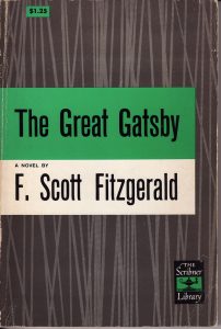
- It’s slightly unclear what this has to do with the story, but sometimes it’s nice to have an interesting, slightly abstract design. (Charles Scribner’s Sons, 1953, Student Edition)
2. Maybe the yellow background had something to do with Golden Age. Fun Fact: This cover was not officially released by a publisher. (Designer: Aled Lewis)
3. This cover combines the beautifully elegant designs of the Art Deco era with the somewhat clunky shape of fog—a juxtaposition not too dissimilar to Gatsby himself. (Penguin Books Ltd., UK edition, 2013)
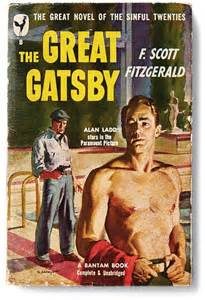
4. It’s a shame that artists don’t paint handsome, shirtless men on the covers of great American novels anymore. (Bantam Books, 1949)
5. This also seems to be from a time when men with chiseled jaws graced the front of books. (Penguin Modern Classics, 1973)
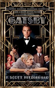
6. Everyone loves a good movie tie-in. (Scribner Books, 2013)
7. Sometimes it’s nice to just have a text-only cover. Title. Author. Logo. It gets straight to the point. (Penguin Books, 2008)
8. An elegant cover featuring Daisy. (Wordsworth Editions Ltd., 1993)
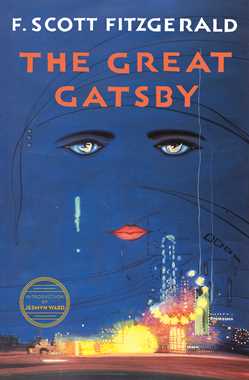
9. And to top it off, here is the cover that graced every adolescent’s desk. This is the most well-known cover (it is the original). It’s interesting that off all the covers shown, this is the only one that features the green light—arguably the most famous symbol from the book. Many eager, young minds spent countless hours dissecting the motifs hidden behind this cover. . .
(Charles Scribner’s Sons, 1925) Designer: Francis Cugat. Get even more info about this special cover here.
This post was originally published on GetLiterary.com.

